Flows Digital Adoption Tool
Create a walkthrough of your webapp for onboarding and training purposes.
Overview
Spekit provides tailored training and guidance, notably with Flows, crafting precise walkthroughs for web apps to enhance user experience.
Problem
Developing process flows can be a labor-intensive and intricate task. In this case study, we employed Woopra to compile the following data:
- The abandonment rate during flow creation is 60%.
- The average time taken for flow creation is 14 minutes.
- The count of flow creations per account is less than 1.
Goal
Optimizing the seamless generation of flows and minimizing the associated time investment are pivotal objectives. The proposed key performance indicators (KPIs) to assess the efficacy of our enhancements include:
- Attain a Flow creation abandonment rate no higher than 20%.
- Achieve a reduction in creation time to below 7 minutes, reflecting a 50% decrease.
- Foster a twofold increase in the quantity of flows generated per account.
My Roles
- User Research
- User Testing
- UI/UX Design
- Prototyping
- Content
Timeline
6 months
100% Positive Feedback
Received overwhelmingly positive comments when compared with previous implementation and design
01
Discovery
User Research/Testing
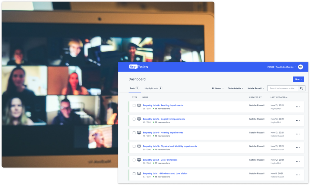
- Conducted over 10 Usertesting.com sessions with random novice users.
- Facilitated 10+ sessions for assessing the experience of new employees.
- Analyzed insights from Prospect and Customer Chorus calls.
- Engaged in Zoom sessions with existing users.
- Executed a thorough UX Heuristic Evaluation.
Market Research
- Evaluation of user input from both internal and external stakeholders
- Comprehensive competitive analysis involving industry leaders such as WalkMe, Appcues, Pendo, among others
- Scrutiny of feedback and requests received through various channels, including emails, Chorus, Slack, and more.
Research Findings
- Inadequate documentation outlining the procedure for Flow creation.
- Challenges encountered in the selection of elements on the page.
- Potential confusion arises from the creation process’s distinct recording and editing phases.
- Unintended steps are introduced due to erroneous clicks, necessitating their removal in subsequent stages of the process.
02
Discuss & Define
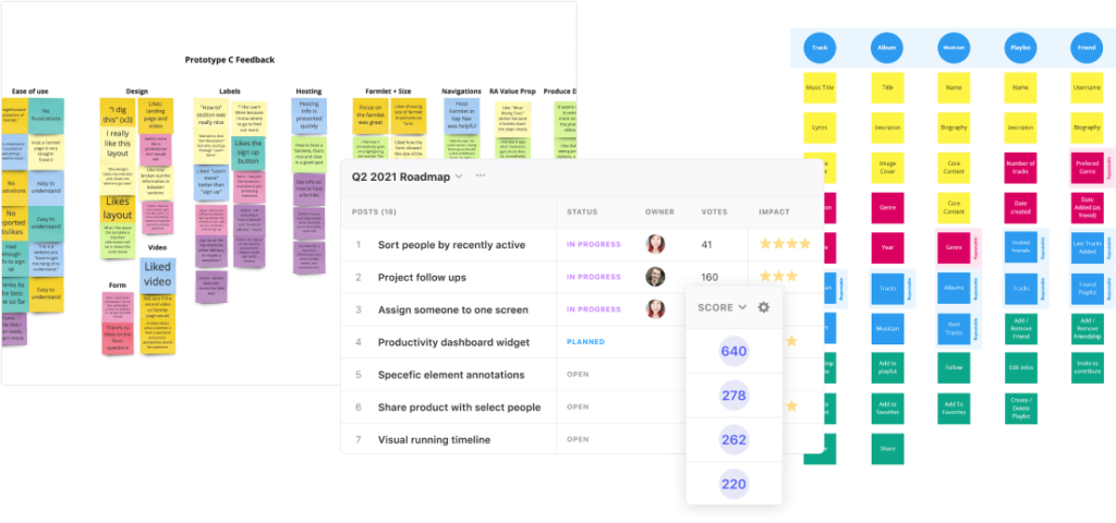
My PM and I crafted a roadmap on canny.io for better comment tracking and feature prioritization. Zoom meetings with cross-team stakeholders covered Affinity Mapping, category setup, and issue resolution. We also collaborated on a Miro affinity mapping board.
Considering the scope of work required to achieve our objectives, we structured our plan into three distinct phases, each spanning three months:
- Phase 1: Functionality – Prioritizing bug fixes, enhancing application compatibility, and refining DOM element selection in the current algorithm.
- Phase 2: Usability – Focusing primarily on design updates and fixes to enhance overall user experience.
- Phase 3: Lovability – The polishing phase, incorporating insights from Phase 1, and adding the finishing touches to elevate the application’s appeal.
03
Design
Following the conceptualization phase in my methodology, the design phase is initiated with specific objectives:
- Enhance clarity in guiding the creation flow for both First Time and Returning Users.
- Introduce transition states between steps/phases.
- Consolidate the Recording and Editing phases.
- Incorporate positive friction to encourage the addition of steps.
Working closely with engineers, we validate ideas early on, using User Maps and OOUX diagrams. Progressing to wireframes and mockups ensures stakeholder clarity and support for updates.
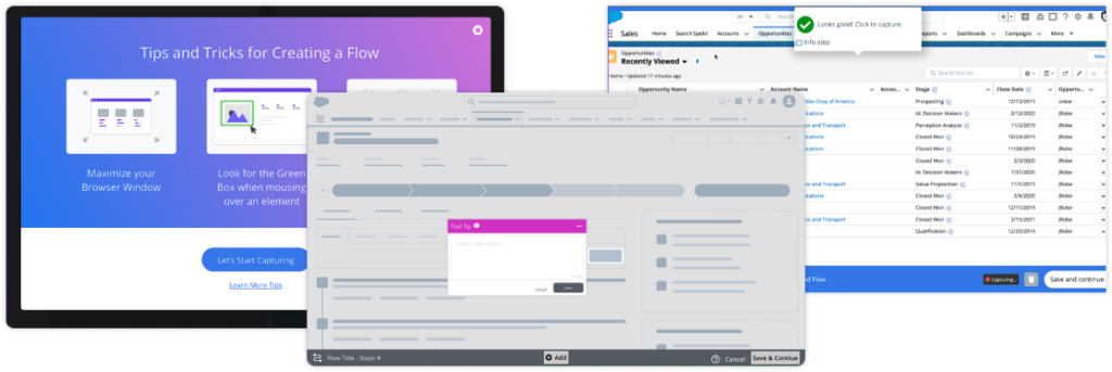
Mockups
Source Files & Prototypes
Mockups and Prototypes were created in Figma. These files were copied over from the work account. Files and projects would normally be organized differently.
- Flows Redesign – Source -Link to my Figma Files. This was recreated from original but gives you an idea of my file structure.
- Flows Redesign – Prototype – Figma Prototype
- Figma Redesign – Loom Walkthrough – Here is a Loom Video of me walking through the Prototype.
Outcomes and Lessons
Decreased Abandonment
10% reduction in abandonment rate in Phase 1
Positive Feedback
100% positive comments when compared with previous designs
Be Agile
Adjust your plan when resources and priorities change


